Shop
DreamUp AI Art
DreamUp
Join
Log In
User Menu
Upgrade to Core
Theme
Display Mature Content
Suppress AI Content
Get Help and Send Feedback
Terms of Service
Privacy Policy
Submit
Deviation
Submit your art
Upload your creations for people to see, favourite, and share.
DreamUp
Turn your dreams into reality
Generate your own AI work.
Status Update
Post an update
Tell the community what’s on your mind.
Journal
Post a journal
Share your thoughts, experiences, and stories behind the art.
Literature
Submit your writing
Upload stories, poems, character descriptions & more.
Subscription
Get your fans' support
Fund your creativity by creating subscription tiers.
CQuake on DeviantArt
https://www.deviantart.com/cquake/art/Flower-170109388
CQuake
Deviation Actions
Add to Favourites
Comment
59
Favourites
Zoomland2
pinkal09
$7.50
600
Download
More by
CQuake
Watch
CQuake on DeviantArt
https://www.deviantart.com/cquake/art/Winter-191534943
CQuake
CQuake on DeviantArt
https://www.deviantart.com/cquake/art/Thoughts-261532355
CQuake
CQuake on DeviantArt
https://www.deviantart.com/cquake/art/Spiral-explosion-167786420
CQuake
CQuake on DeviantArt
https://www.deviantart.com/cquake/art/Rose-190380625
CQuake
CQuake on DeviantArt
https://www.deviantart.com/cquake/art/Mandala-98749708
CQuake
CQuake on DeviantArt
http://creativecommons.org/licenses/by-nc-sa/3.0/
https://www.deviantart.com/cquake/art/Fireworks-2-0-87051972
CQuake
CQuake on DeviantArt
https://www.deviantart.com/cquake/art/Galaxies-87644467
CQuake
CQuake on DeviantArt
https://www.deviantart.com/cquake/art/Neon-newton-87497211
CQuake
CQuake on DeviantArt
https://www.deviantart.com/cquake/art/Psychedelic-nightmare-167783568
CQuake
Suggested Deviants
GeaAusten
Watch
GeaAusten on DeviantArt
https://www.deviantart.com/geaausten/art/twixt-the-green-sea-and-the-azured-vault-775441426
GeaAusten
GeaAusten on DeviantArt
https://www.deviantart.com/geaausten/art/Oriental-Flower-773498882
GeaAusten
GeaAusten on DeviantArt
https://www.deviantart.com/geaausten/art/Beautiful-Lilac-Dreams-776770867
GeaAusten
jhantares
Watch
jhantares on DeviantArt
https://www.deviantart.com/jhantares/art/Jwildfire-graphic-839353282
jhantares
jhantares on DeviantArt
https://www.deviantart.com/jhantares/art/jwildfire-fractal-pattern-900239642
jhantares
jhantares on DeviantArt
https://www.deviantart.com/jhantares/art/jwildfire-fractal-manipulation-889652447
jhantares
ButterflyBlew
Watch
ButterflyBlew on DeviantArt
https://www.deviantart.com/butterflyblew/art/Blue-and-copper-881995220
ButterflyBlew
ButterflyBlew on DeviantArt
https://www.deviantart.com/butterflyblew/art/Tropical-Blue-881587200
ButterflyBlew
ButterflyBlew on DeviantArt
https://www.deviantart.com/butterflyblew/art/Blue-pinwheel-891824244
ButterflyBlew
Suggested Collections
Fractal
wolfepaw on DeviantArt
http://creativecommons.org/licenses/by-nc-nd/3.0/
https://www.deviantart.com/wolfepaw/art/Julian-ESplits-Medallion-562825899
wolfepaw
Fiery-Fire on DeviantArt
https://www.deviantart.com/fiery-fire/art/Cosmic-Summer-613739336
Fiery-Fire
Thelma1 on DeviantArt
https://www.deviantart.com/thelma1/art/Wonderful-Colours-212479480
Thelma1
Fractal Art
technochroma on DeviantArt
http://creativecommons.org/licenses/by/3.0/
https://www.deviantart.com/technochroma/art/The-Butterfly-s-Dream-505249151
technochroma
Dawgit on DeviantArt
https://www.deviantart.com/dawgit/art/C4ee-557630839
Dawgit
technochroma on DeviantArt
https://www.deviantart.com/technochroma/art/Avalon-528739934
technochroma
Fractal Art
Luis-Bello on DeviantArt
https://www.deviantart.com/luis-bello/art/4-389939622
Luis-Bello
LoloTheDabbler on DeviantArt
https://www.deviantart.com/lolothedabbler/art/MandelBrowser-210323-110045-874365705
LoloTheDabbler
wolfepaw on DeviantArt
http://creativecommons.org/licenses/by-nc-nd/3.0/
https://www.deviantart.com/wolfepaw/art/Color-in-Bloom-355448581
wolfepaw
You Might Like…
Cadmonia on DeviantArt
https://www.deviantart.com/cadmonia/art/Plumage-4-174241786
Cadmonia
blusilva on DeviantArt
http://creativecommons.org/licenses/by-nc-nd/3.0/
https://www.deviantart.com/blusilva/art/The-Fragile-51275119
blusilva
Lady-Compassion on DeviantArt
https://www.deviantart.com/lady-compassion/art/Her-Diamonds-276806472
Lady-Compassion
chetje on DeviantArt
https://www.deviantart.com/chetje/art/UF-Frump2-january-2020-827762170
chetje
Fractalholic on DeviantArt
https://www.deviantart.com/fractalholic/art/Fractalholic-4302-380656918
Fractalholic
Ruiorven on DeviantArt
https://www.deviantart.com/ruiorven/art/Frost-Elven-Ruins-341781481
Ruiorven
HBKerr on DeviantArt
http://creativecommons.org/licenses/by-nc-nd/3.0/
https://www.deviantart.com/hbkerr/art/Complex-Sentiment-150508787
HBKerr
UberMari0 on DeviantArt
https://www.deviantart.com/ubermari0/art/Wedding-Bouquet-87216427
UberMari0
DeTea on DeviantArt
https://www.deviantart.com/detea/art/Green-Peace-452544518
DeTea
Featured in Groups
See All
AllThingsFractal
GIMPies
GetDailyDeviations
ShareYourFractals
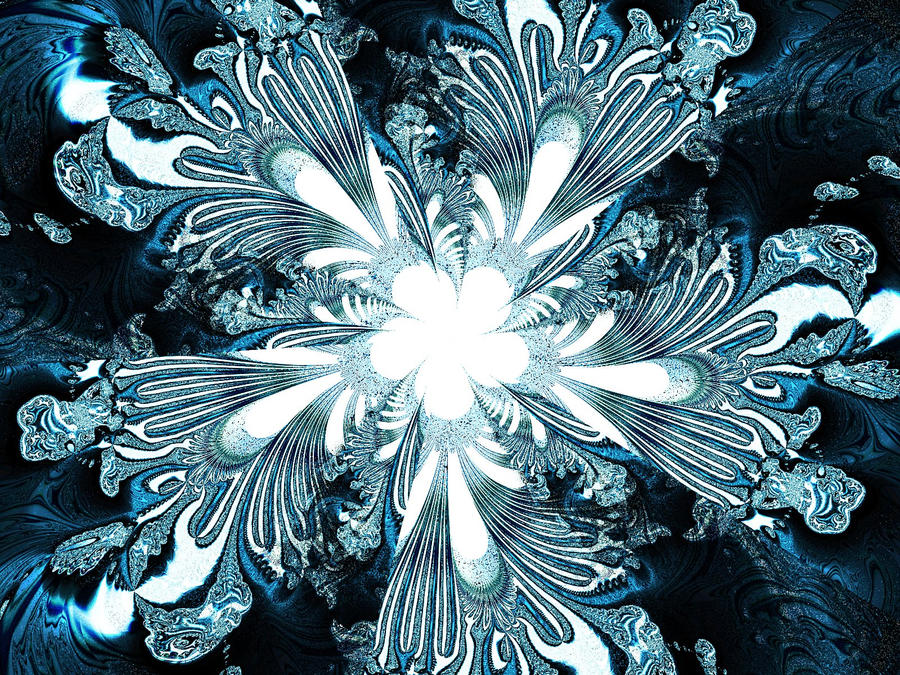
Flower
By
CQuake
Watch
Published:
Jul 5, 2010
41
Favourites
11
Comments
1.8K
Views
Description
Inverse-kaleidoscopic-ish flower. Plain, simple and somewhat metallic.
UF + GIMP
Image size
1600x1200px 987.92 KB
© 2010 - 2024
CQuake
Comments
11
Join the community
to add your comment. Already a deviant?
Log In
maggy53
Dec 25, 2010
Beautiful!!!
Reply
Load more